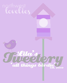
Pottery Barn Kids inspired art take two! It was time to make another of these for Miss Lila.
Camille's Princess Dress Boutique art was recently featured on
Knock Off Decor! I thought I'd do a little tutorial since I recently learned about screen capturing! Here's a little play by play on how to make your own...
*Disclaimer*
I have very limited knowledge of Photoshop Elements and this is only how I did it. It is by no means the right way to use any of the features described below. :)
Step 1: Open a file blank file in PSE. File> New> Blank File
Step 2: Set size as 16x20 inches, resolution 300. You can still print it smaller than this, but if you make it this size you have the option of printing it this size. If you want it bigger, then you can do that as well!
Step 3: Once you have a blank document, you can use the T tool to add your text. I wrote each of these words/phrases separately (typed them into their own text box) so they could be moved around and sized independent of one another. I worked on it until I found a placement that looked good to me. The text is all somewhere between 100 and 250pt. because the document is so large (this font is Creampuff). On
Camille's princess dress boutique sign, I used different fonts, but in this case I liked the look of the same font for all of the text. I changed the text colors while the T tool was selected, once again working on it until it looked right. If you want some of the words to be in front of others, make sure they are higher up in the layers box (bottom right). For example, 'all things birdie' is slightly overlapping the y in Tweetery, because it is above Tweetery in the layers box. I also chose an overall color by using the bucket tool to fill in the background.
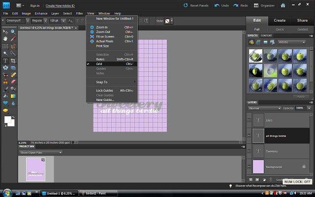
Step 4: I like to turn the grids on so I can see if my words are centered and lining up nicely. View< Grid. I usually turn this off after I've checked though, because it makes it hard to see the picture.
Step 5: To add the graphics, I bought some digital clipart from the same
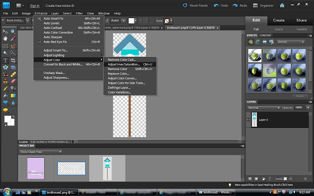
Etsy shop that I bought Camille's dress art. I wanted a bird house that was lavender and was having a hard time finding one, but then I realized there's a way to change the color of your clip art! I opened up a turquoise bird house and then went to Enhance< Adjust Color< Adjust Hue/Saturation. A box will open that allows you to play with the levels of hue, saturation, and lightness.
Step 6: This part is so easy! This bird was the same turquoise color as the house above. I slid the arrow toward the purple, and the bird changed color! Then I slid the arrow to the left on saturation to take the color down a notch. I adjusted the lightness as well to lighten her up.
Step 7: Once you've adjusted the color of your clip art (if necessary), drag it from the project bin into your open document. There you can resize and decide on placement. I wanted the bird house to be behind all of the words, so I had to move it on the bottom of the layers list. I also changed the opacity of the bird house. Once it was inserted into the document it still looked a little bright to me, so while it was selected I took the opacity (in the layers box) of that layer down to 70%.
Here's the outcome again (final product will be minus the watermark). I'm amazed what you can make in PSE, even with only basic knowledge!
I haven't had this one printed yet, but I'll order a 16x20 at Costco for $5.99! Such a great price for adorable personalized art!

Linking up to...